Topseat Unveils New Logo and Wordmark Reflecting Innovation and Design Precision
August 8, 2025 — Plano, Texas
Topseat International Inc. today officially introduced its new “t” logo and refreshed wordmark, marking an exciting evolution of the brand’s visual identity.
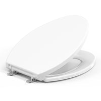
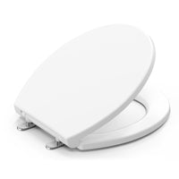
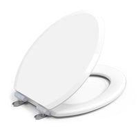
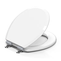
The new Topseat Icon features a stylized lowercase “t”, seamlessly incorporating the shape of a U.S.-elongated toilet seat into its design, symbolizing engineering precision, refined aesthetics, and the company’s focus on product innovation.
The accompanying wordmark “topseat” pays tribute to the brand’s craftsmanship and design innovation. In the wordmark, the letters t integrate the elongated seat, while the letters o, p, and a feature the outline of a U.S.-round toilet seat, visually uniting Topseat’s two most iconic product forms within the logo itself. The design captures the essence of Topseat’s philosophy — where technical excellence meets aesthetic harmony.
“Our new logo and wordmark reflect who we are today — a design-driven, technology-inspired toilet seat company reimagining everyday comfort,” said Sarah Kim, spokesperson for Topseat. “They capture the essence of Topseat: functional beauty, precision engineering, and quiet confidence.”
The updated visual identity will be rolled out across all Topseat products, packaging, digital platforms, and marketing materials globally over the coming months.


Share


